Light Table 0.5.0
22 Aug 2013 - Chris Granger
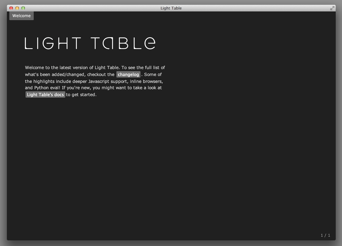
After much ado, I’m happy to announce that Light Table 0.5.0 is out today:
Go give it a try!
Faster, better, stronger
This release was about simplifying the experience of Light Table, making it far more robust, and making sure it’s fast enough to handle whatever you throw at it. We’ve made big strides in each of these areas, from removing some of the UI elements that didn’t add anything (the left vertical menu), to reaching the point where we can open large files as fast vim. In many ways this release is foundational compared to 0.4.0, which was about stretching the limits of eval, but this is an incredibly important step toward plugins - we’re finally at a solid base.
Simple
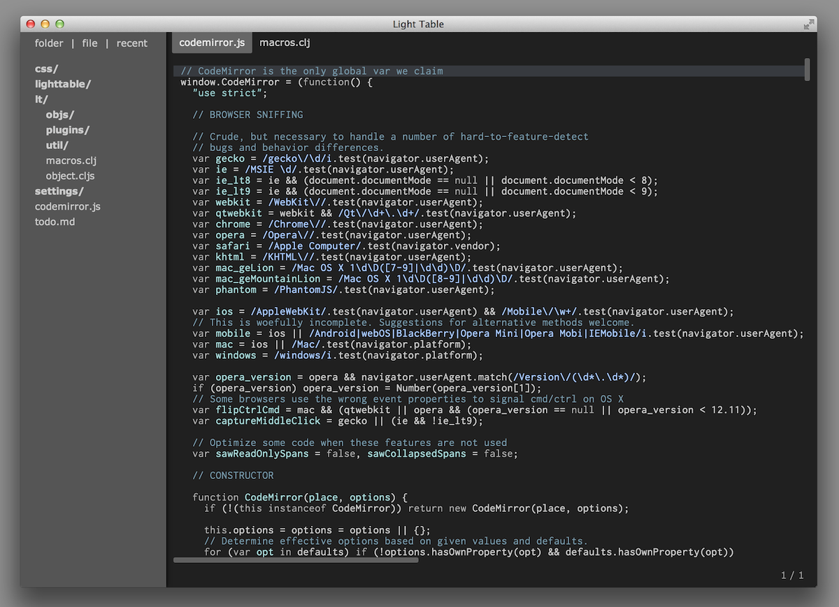
This go around we spent a lot of time making LT lighter, more predictable, and more helpful. One thing I saw as I started watching people use Light Table is that they felt that it was still “heavier” than something like Sublime, which made it a lot scarier to them. Ultimately, we attributed that feeling to doing some unfamiliar things, one of the biggest of which, was the lack of standard menus. We don’t really gain anything by not doing menus and while there were some technical reasons I couldn’t add them, I’ve modified node-webkit to fix that. This means that the vertical menu is now gone from the left side. You can’t get much “lighter” than LT is now:
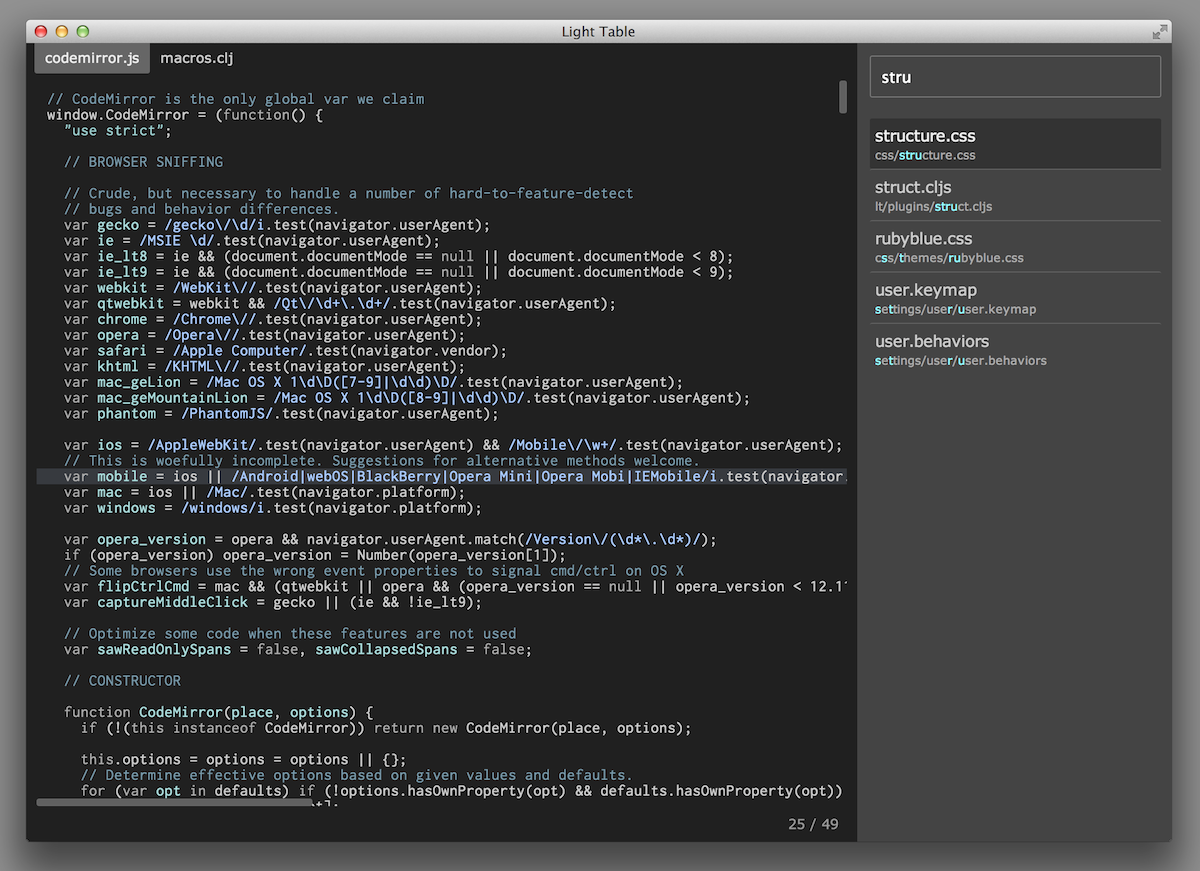
There are numerous other little design tweaks that in aggregate make the workflow significantly better and far simpler. For example, transient panels like navigate and commands now slide from the right and are presented in a much more readable fashion. This makes opening them a lot less jarring and doesn’t cause a heavy context switch.
Powerful
This wasn’t just a clean-up release though. We added some very powerful new features, the most interesting of which are “watches” and the behaviors system.
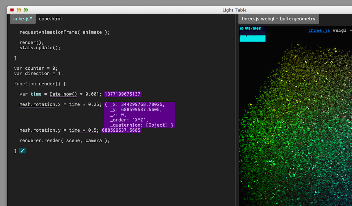
Watches give you an instarepl-like experience that is driven by your code executing normally in your program. You can think of it as a next-gen version of println where whenever a watched expression would normally be executed in your code, the value is streamed back to LT and shown in line. Watches work for all 3 of the core languages (Clojure, JS, and Python)! Here’s a little video of them in action:
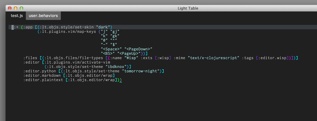
The other big improvement is a uniform strategy for settings that has a ton of flexibility and power. Light Table has always had behaviors as first class notions and I came to the conclusion that settings are really just a way to add or remove behaviors. Settings are simply a way to twiddle which behaviors are added to tags. This is what behaviors files let you do in 0.5.0 and it enables all sorts of fun things; you can give all editors instant eval, you can set colors based on syntax, you can set basically anything depending on context… Really, it’s a form of simplistic programming where you can fundamentally change the behavior of LT without writing any logic. This strategy also has a number of non-obvious benefits as well, like making plugin conflicts something that an end-user can deal with - just remove the behaviors that are screwing things up. Behaviors can also be set globally and per workspace, which gives you a lot of opportunity for crafting the experience based on exactly what you’re doing. Similarly, keys are now defined in keymap files that allow you to bind any command based on context.
Fast
With the work we did to add background processing and a good deal of effort toward ensuring everything ran fast, LightTable is now comparable in speed to Vim and faster than Emacs or Sublime in most things. The addition of a threading model means that lots of things that were blocking the UI no longer do so thanks to some magical hackery (given the lack of threads in JS). Everything from opening files, to project-wide search, to watching the file system, should feel a whole lot smoother.
Healing 1000 papercuts
We touched virtually every aspect, every line of code in Light Table with this release, from dramatically simplifying the “deploy” and adding a command line interface to unifying settings and revamping the design. The end result is a release that has a 1000 things better in it, all adding up to something that just feels far better than what we started with. This is the first release that I’m really proud of for Light Table - it’s finally a real contender.
To plugins we go!
The next big step for us is the infrastructure necessary to support end-user plugins for Light Table, which we’ll be rolling into our private beta. I know a lot of people have been asking about getting into the beta after missing the kickstarter. We’ll be talking about our specific plans in that regard in the next couple weeks. Either way, we know plugins are where the magic of LT will really start to shine and there’s no telling where it’ll ultimately take us.
